Redesigning
The Local
The Local is a network of news websites, providing daily reporting from different european countries in Englisch, which started as a newsletter in sweden. For each country, one website is set up, named thelocal.tld (e.g. “.de”), all of which look the same. We did a redesign of the german outlet of the network for a course about web typography at university of applied sciences in Potsdam led by Chris Magiera.
Status Quo
Strengths and weaknesses
Grid & Layout

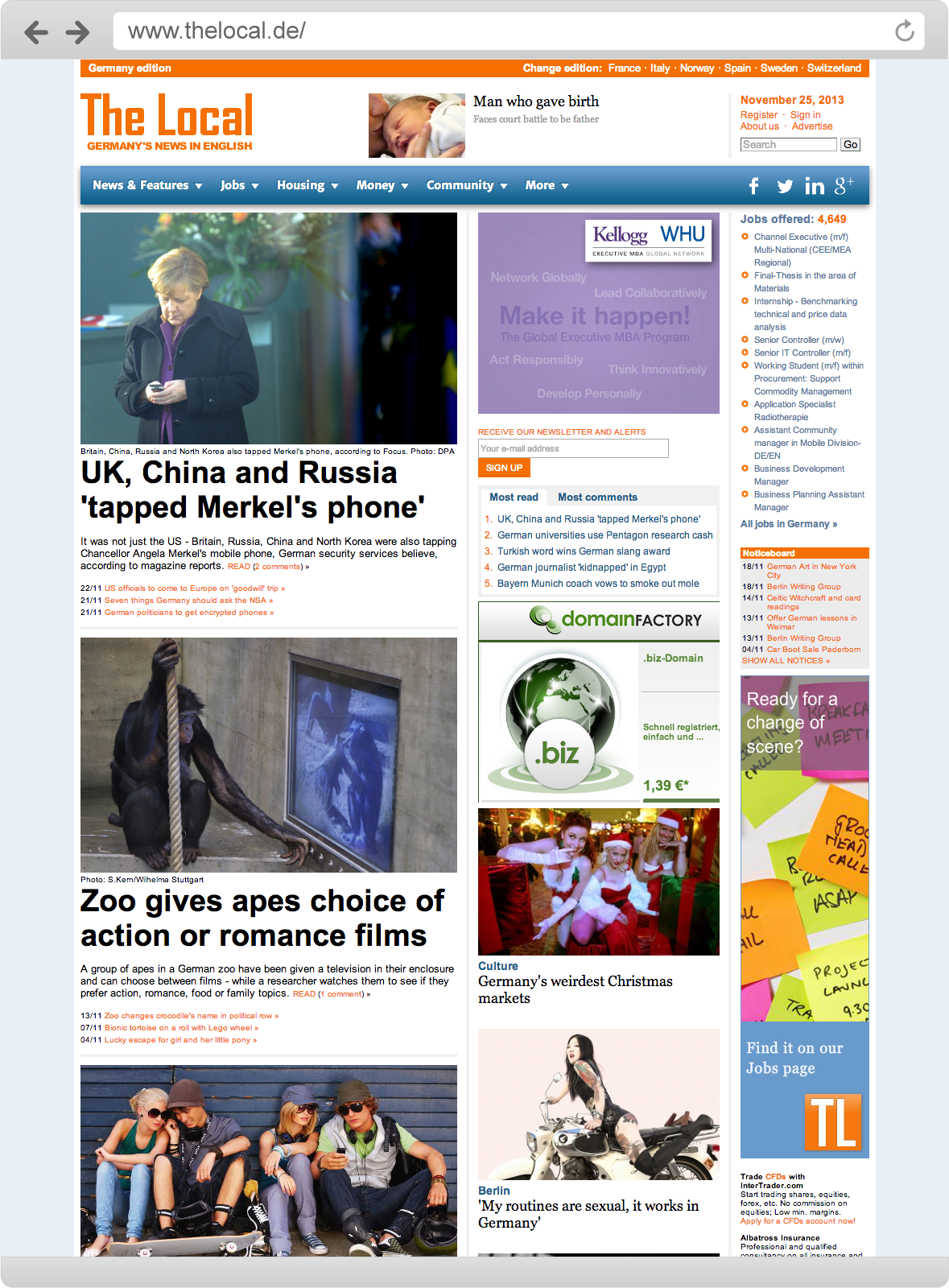
The current Website has a 1000 pixel fixed-width and centered layout with three columns which is consistent for the whole website. The design is not responsive, a mobile version is provided via the subdomain m.thelocal.de.
Colours

The site is using a fairly big amount of colors. Most of them are used “flat”, with exceptions for the main navigation and the footer, which have a gradient background.
Typography
The Local used at least three different fonts, each in multiple weights and styles. The Main typeface for the content is Arial, headlines are displayed in Georgia (interestingly with fallbacks for Palatino Linotype and Book Antiqua, which will almost never appear). The navigation exclusively is set in Merriweather Sans provided bei Google Fonts. The typographic details show many flaws, mainly inconsistent font faces and sizes as well as bad spacing.
Information architecture
Hierarchy
Two of the three columns on the homepage are used to present articles and galleries on the the site.
The left column is significantly wider than the other two and supposedly is used to display the main or most recent articles. Due to the fact that neither the date and time of the articles nor their category is shown with the articles teaser it remains unknown in which way the articles are ordered.
The center column also displays articles, this time with their corresponding category, but also missing date and time informations and showing multiple redundancies with the articles in the main column.
The third column is used to display ads and other services by The Local network.
Conclusion
Through its overall design and information architecture The Local does not look like a professional news outlet. There is no visible architecture in the informations presented, the hierarchy seems random and redundancies are making it hard to navigate. Especially when it comes to typography, which is the key parameter in presenting text based news, the site is performing significantly worse than other only news websites.
Redesign concept
“Throughout the redesign The Local is focused on the presentation of reliable journalistic content through good readability and clear hierarchy. The discovery and sharing of content in social networks is enforced.”
Thelocal.de has an output of round about 10 articles per day. Most of them rather short, containing just a few paragraphs. Through our redesign, we wanted to embrace the shortage of most articles and focus on displaying them attractively and in the center of attention while eliminating many of the current elements arranged around the article and distracting the users attention.
Another goal was to have a clear hierarchy in the content, which led us to display every articles category and timestamp with its teaser already. This way, the user is able to recognize the way the content is sorted easily, not leaving him or her bewildered at the homepage. And of course we eliminated the occurring redundancies which seem the be distractive and somehow unreliable.
We wanted to make the site responsive in order to make it usable on all screen sizes without the need to switch to a special site optimized for mobile devices (currently at m.thelocal.de). This favors a consistent design and the fact that more and more users are using their small devices for browsing the web.
We also reduced the amount of colours used in the layout to make the design more consistent and switched to a more distinct color scheme, roughly based on the currently used one.
Many of the functions currently located on extra pages, like the login, or the weather got implemented in the layout through unobtrusive hideable elements.
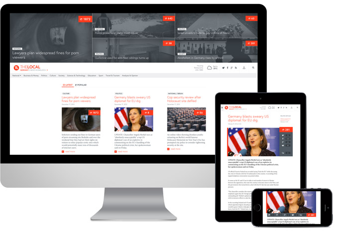
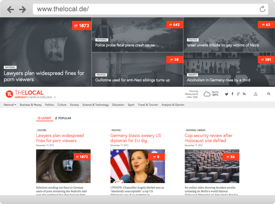
We found out, that an above-average amount of users are driven to The Local by links in social media networks, especially reddit. Through better implementation of the sharing functions for those networks, we want to enforce this effect to increase the number of users. Also, because social media is such an important factor for the local, we decided to use a social media index counter for each article to make its relevance visible. It shows the calculated amounts of facebook interactions, tweets, +1’s and reddit points and is prominently located in the images of the teasers and in the head of articles. Already in the teasers, the sharing functions are implemented, appearing on mouseover on the index. Another way to embrace social media is the possibility to rank the articles on the homepage not only by time, but also by their index. With that function we implemented a way to define the timespan, so highly rated articles within one week, 24 hours and six hours can be shown.
Every The Local website is dedicated to the news of its respective country. We wanted to achieve a better linking among the several editions, which is why we prominently placed an area with highly ranked articles from other countries versions in the homepage. Switching the edition is still possible through a dropdown below the logo and in a navigation in the footer area.
New to the homepage is a area above the main header. It is showing editorially chosen articles, which are displayed in a grid with five tiles in the full width of the viewport. Its purpose is to highlight important headlines from the last days, besides from sorting articles by time or social media index.
Key goals for our redesign
(Short-)content-sensitive Grid
Logic categorizing and sorting
Responsive Layout
Consistent color concept
Better readability through better typography
Focus on social media functions for displaying and sharing content
Better linking of interesting content within the The Local network
Development steps
How we did the redesign
Use Case & Wireframes
After some short research we developed several use cases for The Local. We decided to concentrate on the one we called “social media reader”, which is basically a person visiting a The Local article through a link on a social network, reading it, sharing it him or herself and checking for other interesting content on the articles site and the homepage. Based on the use case we developed a wireframe, laying out the basics for the arrangement of the redesigns elements and for testing our use case. The wireframe set the basics for the screendesign.
Screendesign and Prototype
Use case and wireframe led to the screendesign of the new home and article page. The design was done for the desktop version while keeping the responsiveness of the site in mind. After finishing it, we built a running prototype (see below). The prototype was implemented using the latest HTML 5, CSS 3, LESS, jQuery, Font Awesome Icons and the Frameless grid system.
Typographic concept
For the typography we reduced number of fonts to two. For the headline font, we choose “Europa”, a sans serif typeface, which we mostly used in light weights for a greater contrast to the running text. It is also used für the categories, dates and interactive elements such as buttons. The running text is set in “Calluna”, which is comfortable reading even at very small text sizes. Both are Webfonts provided by Typekit. The font sizes increase and decrease in 2 pixel steps.
The main color of the new design is equally to the typeface used for headlines, links and other interaktive elements, while the secondary color is used for teaser texts, dates and categories.
For better readability we added sub headlines, quotes and other typographic elemets to the articles, which are not used at the moment.
For displaying all the elements and their corresponding styling we built a teste site for an article and typographic demo site.
See the typographic demo site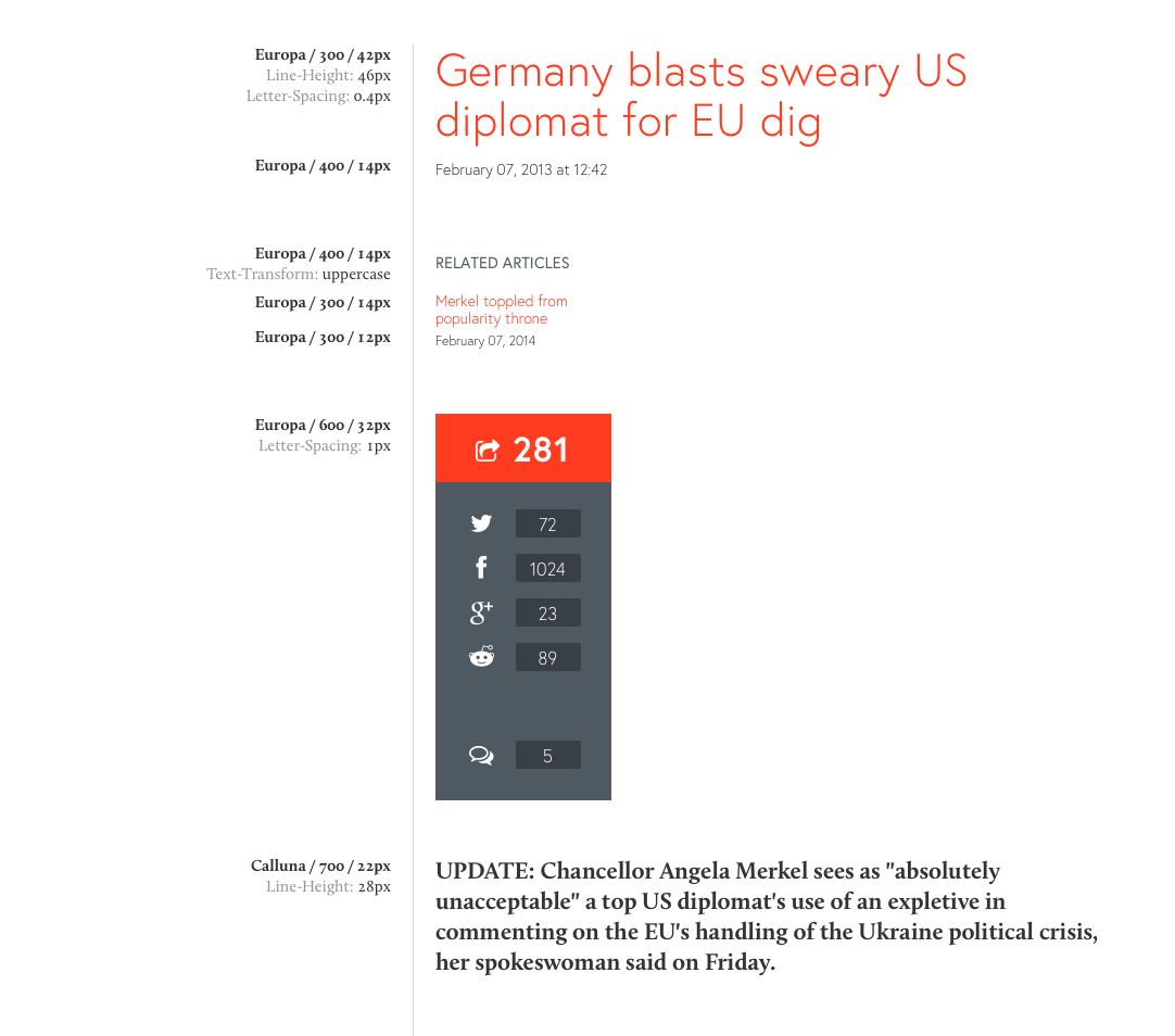
Prototype
The working prototype of the site shows the homepage of the redesign as well as two different articles. Make sure to scale your browser window to check on the responsiveness of the site.
See the working prototypeConclusion and Outlook
Some parts of the website have not been designed and prototyped which still could be done. Also, the work on the responsiveness could not been finished throughout the course. We went down to tablet sizes, still missing smartphone devices.
We are aware that many of the changes we did in the redesign may touch features (by our means problems) which were implemented on purpose e.g. to achieve high rankings in search engines and lead users to services and ads on the site. Nevertheless our redesign focused on making The Local a serious news site and a joy to consume news. What we hopefully did. Thanks for your interest.